
GraphPro
Turn your saved searches into live, interactive trend charts — with moving averages, trailing sums, and KPI summary cards — right on your NetSuite Home dashboard. No exports, no spreadsheets.
Data Converted into Actionable Trends
10 Saved Searches in One Portlet
Deep Visual Breakdowns & Aesthetics
Core Charting Capabilities
Four charting features turn the saved searches you already maintain into a live trend view — no exports, no rebuild.

Saved-Search Charting
Chart up to 10 saved searches in a single portlet — view one at a time, or compare several side by side on the same chart.
- Daily, weekly, monthly, quarterly, or yearly grouping — calendar-aligned
- Line, column, or horizontal bar chart types

Moving Averages & Trailing Sums
See the real trend beneath period-to-period noise, or switch any search to rolling totals.
- Configurable 2–30 period moving-average overlay with slider
- Trailing Sum mode for rolling totals, e.g., trailing 12-month revenue

Stacked Breakdowns & Themes
Split any search into a stacked chart by a column’s distinct values — sales by rep, expenses by department.
- Stacked areas or bars, one segment per distinct value
- Five curated color themes — red is reserved for negative change

KPI Cards & Live Legend
Every active search gets a KPI card summarizing its latest value, N-period average, and previous-period change.
- Green ▲ / red ▼ change indicators at a glance
- Clickable legend chips show or hide any series instantly
Your Dashboard, Your Trends
- Tabs & Comparison: One tab per search; Ctrl-click to compare several on a single chart. Your selection is remembered automatically.
- Moving-Average Slider: Drag to widen or narrow the window — the chart and KPI cards update immediately.
- KPI Cards: Latest value, N-period average, and previous-period change for every active search.
- Live Legend: Click any legend chip to show or hide a series without leaving the dashboard.
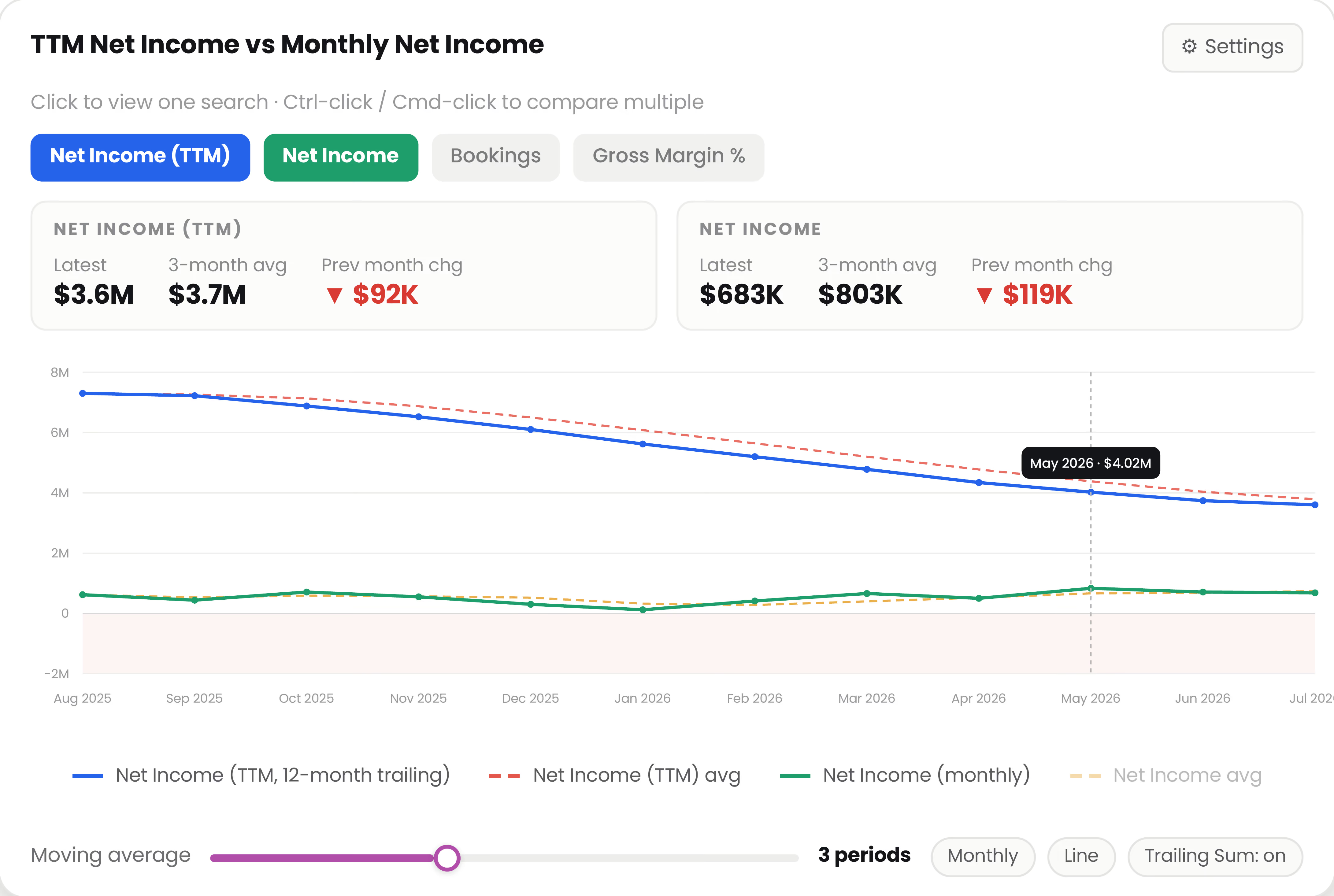
The
Graph Pro portlet: search tabs, KPI cards, moving-average overlay, and clickable legend.
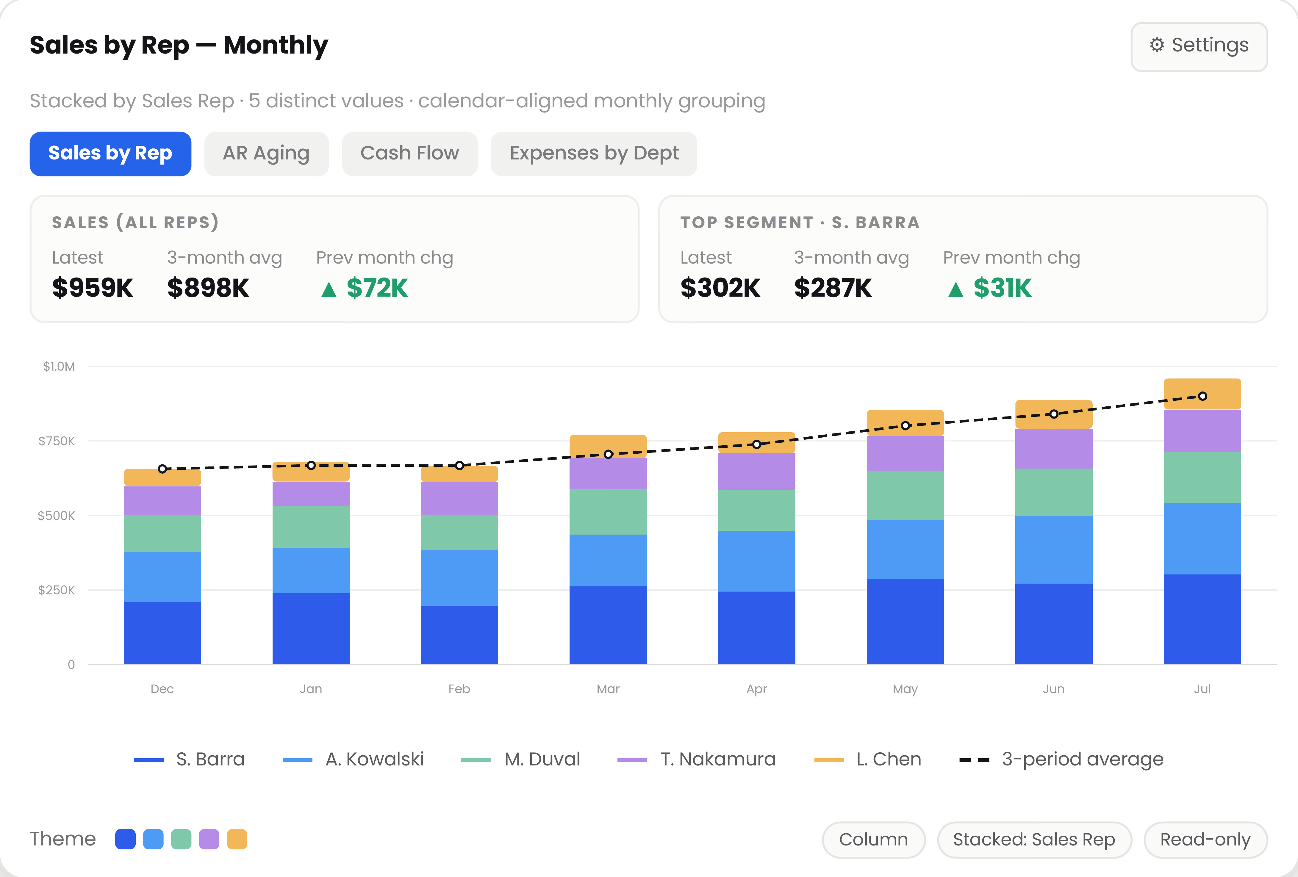
Stacked column view: sales by rep, monthly grouping, with the 3-period moving average of the stacked total overlaid.
Split Any Search by the Column That Matters
- Stacked Segments: One segment per distinct value in the column you pick — sales by rep, expenses by department, revenue by subsidiary.
- Chart Types: Line, column, or horizontal bar, as stacked areas or stacked bars.
- Calendar-Aligned Grouping: Daily, weekly, monthly, quarterly, or yearly — periods line up with your fiscal calendar.
- Curated Themes: Five color themes to match yourdashboard; red stays reserved for negative change.
Built for Everyday Reporting
.svg)
Multiple Instances
Add Graph Pro more than once and place ready-made widgets — Sales, AR Aging, Cash Flow — side by side on a single dashboard, each pre- configured with its own searches and settings.

Personal by Design
Tab selection and moving-average window are private to each user, while the underlying saved-search definitions stay shared and consistent across the team.

Safe & Read-Only
Graph Pro only reads your saved searches. Nothing is ever written back, and NetSuite roles, permissions, and record-level governance are fully respected.

Works With What You Have
No new data model and no integration project — point the portlet at the saved searches your team already maintains and pick the columns to chart.